Modica Conversational Inbox
Messaging Web Application Redesign
Modica Group is an enterprise messaging company that provides a platform for SMS communication on a global scale.
Upon joining the applications product squad at Modica, I conducted a foundational research study alongside the team. The intention for this research was to gain a deeper understanding into users’ expectations and their behaviours in using our toolsets. In turn this would assist with forming a product strategy for the applications team.
We wrote about our experiences with the research project over at UX Collective’s Bootcamp publication, covering the full journey from planning and recruiting through to our analysis steps.
For context into Modica’s applications: we typically split the classification of our product offerings between 'broadcast' and 'engagement'. Broadcast solutions are designed to send to a very wide audience at once (e.g. a marketing campaign to a list of 100,000 subscribers) and engagement solutions are focused on one-to-one conversations (e.g. a recruiter getting in touch with select recipients to fill a last-minute hospitality shift).
We gained a lot of valuable insights from talking to our decision-maker and end-user customers. The most common thread we had seen across the research study was difficulty in having a back-and-forth conversation in Web2SMS, our primary engagement application. Users frustratingly had to switch between the 'Inbox' and 'Message History' tabs to view both incoming messages and the responses they had sent.
And so, we set out to solve this pain point. We built a new messaging Inbox to let users view a unified conversation history.
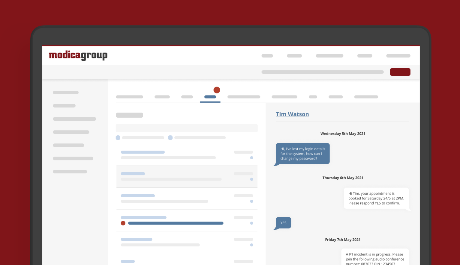
The Original
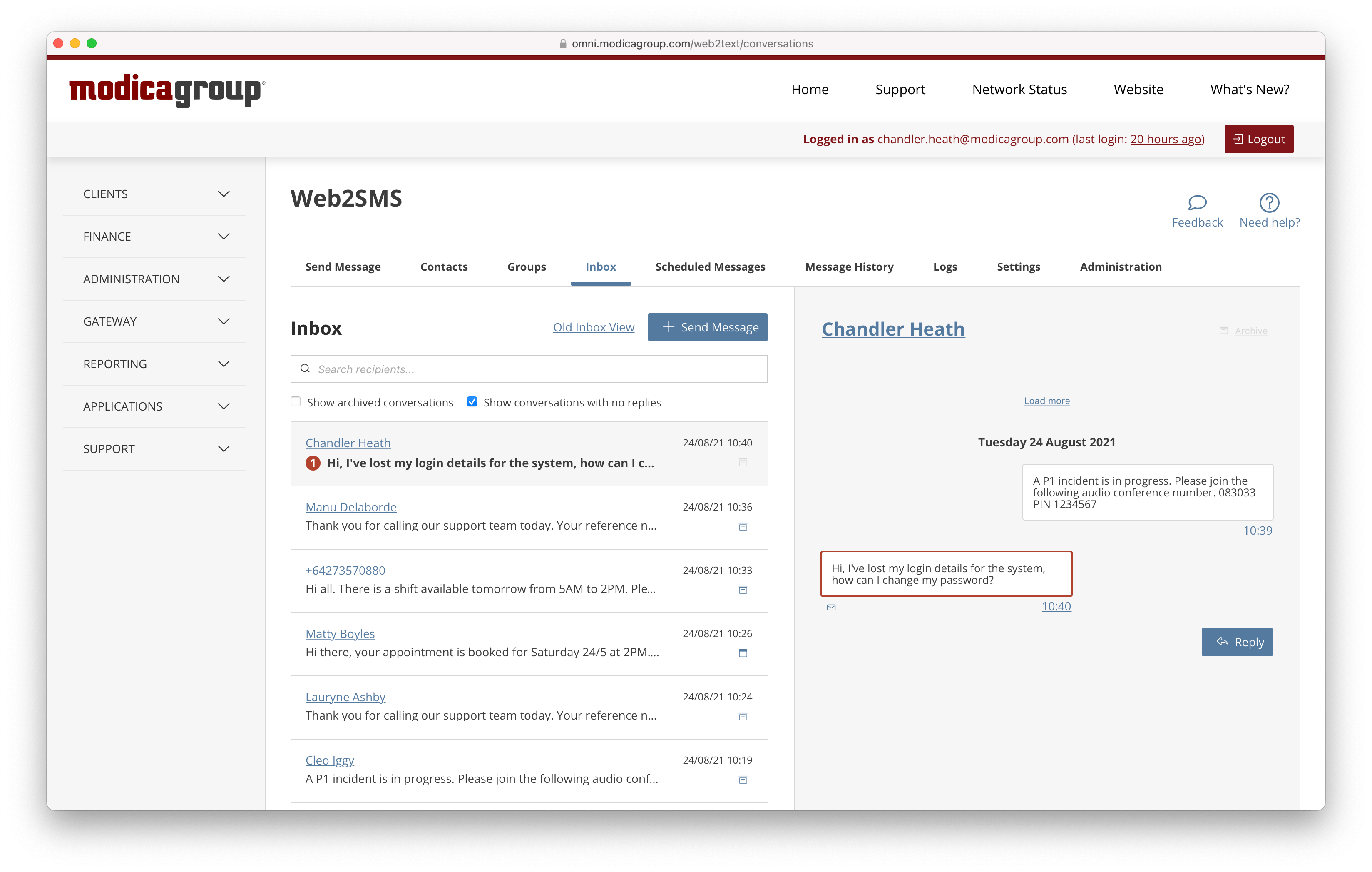
The Redesign
Discovery
We started by auditing the features of the existing inbox, as we didn’t want to remove any functionalities unless it was a strategic decision. This helped us to define the context for the re-design and understand the existing user journeys.
We also came up with questions to take to subject-matter experts across Modica to understand the current solution and any limitations, technical or otherwise, that we might run into during the project.
Before we moved to ideation we spent some time looking at competitors and other messaging products to understand how their interfaces solve similar problems.
Based on our understanding of the pain points of the existing Inbox and all the feedback we had collected, we distilled the challenges to solve into three main aspects:
A Web2SMS user having a back-and-forth conversation with their customer.
How might we make talking with your customer feel as natural and stress-free as texting your friend about your weekend plans?
A Web2SMS user viewing all of their recent conversations.
How might we help our customers feel satisfied that they have everything under control and know just what to do next?
A Web2SMS user looking for a conversation they've had with a customer in the past.
How might we make it easy to find that interaction you had with your (irate) customer last week while you simultaneously placate that same customer over the phone and look up the invoice she's complaining about?
We also set an overall hypothesis for the project:
We believe that by improving the user experience for holding a conversation in Web2SMS, we will increase the number of replies sent per active user.
Workshops
Great ideas don’t come solely from the product team. We wanted to leverage knowledge from Modicans across all areas of the business to assist with solution ideation for the new inbox.
Prior to any design, we set up a series of workshops to discuss our three opportunities and brainstorm potential solutions. Stakeholders from marketing, support, sales, and more joined in on these.
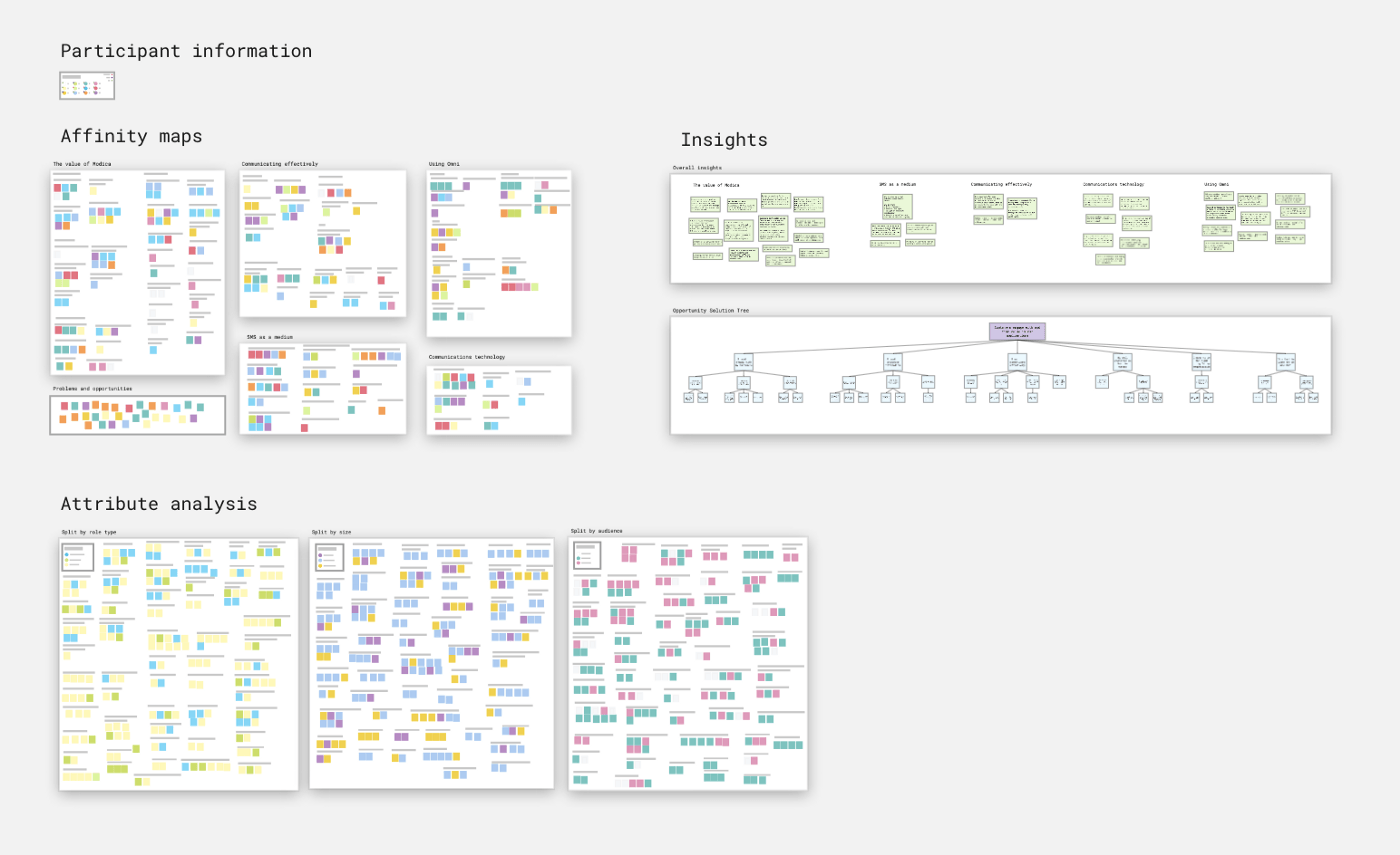
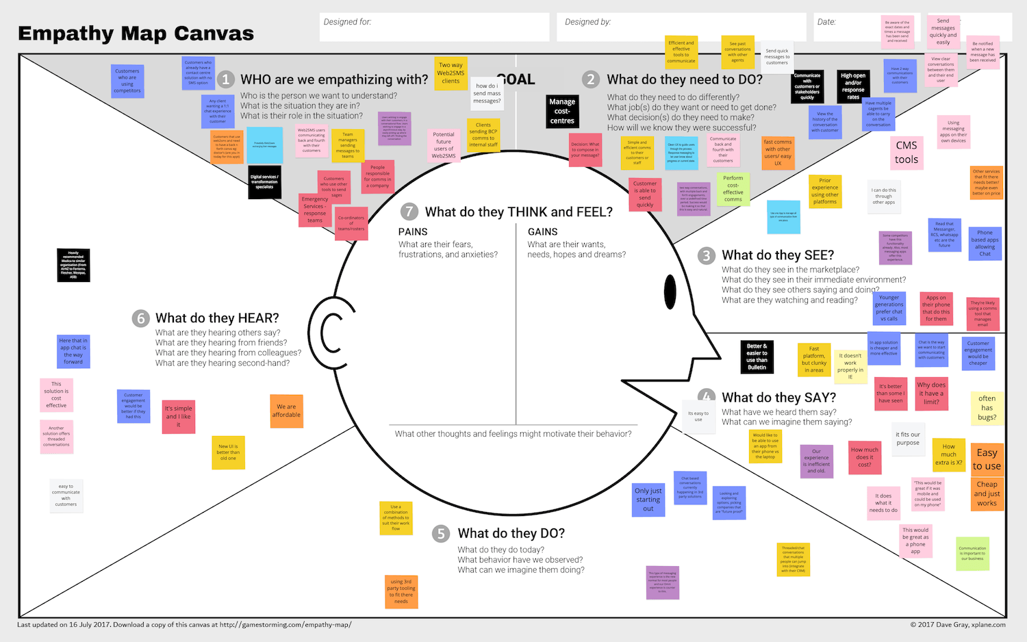
Throughout the workshops we created an empathy canvas map, ran a series of lightning demos, and performed rapid ideation through a series of creative exercises.
Design Concepts
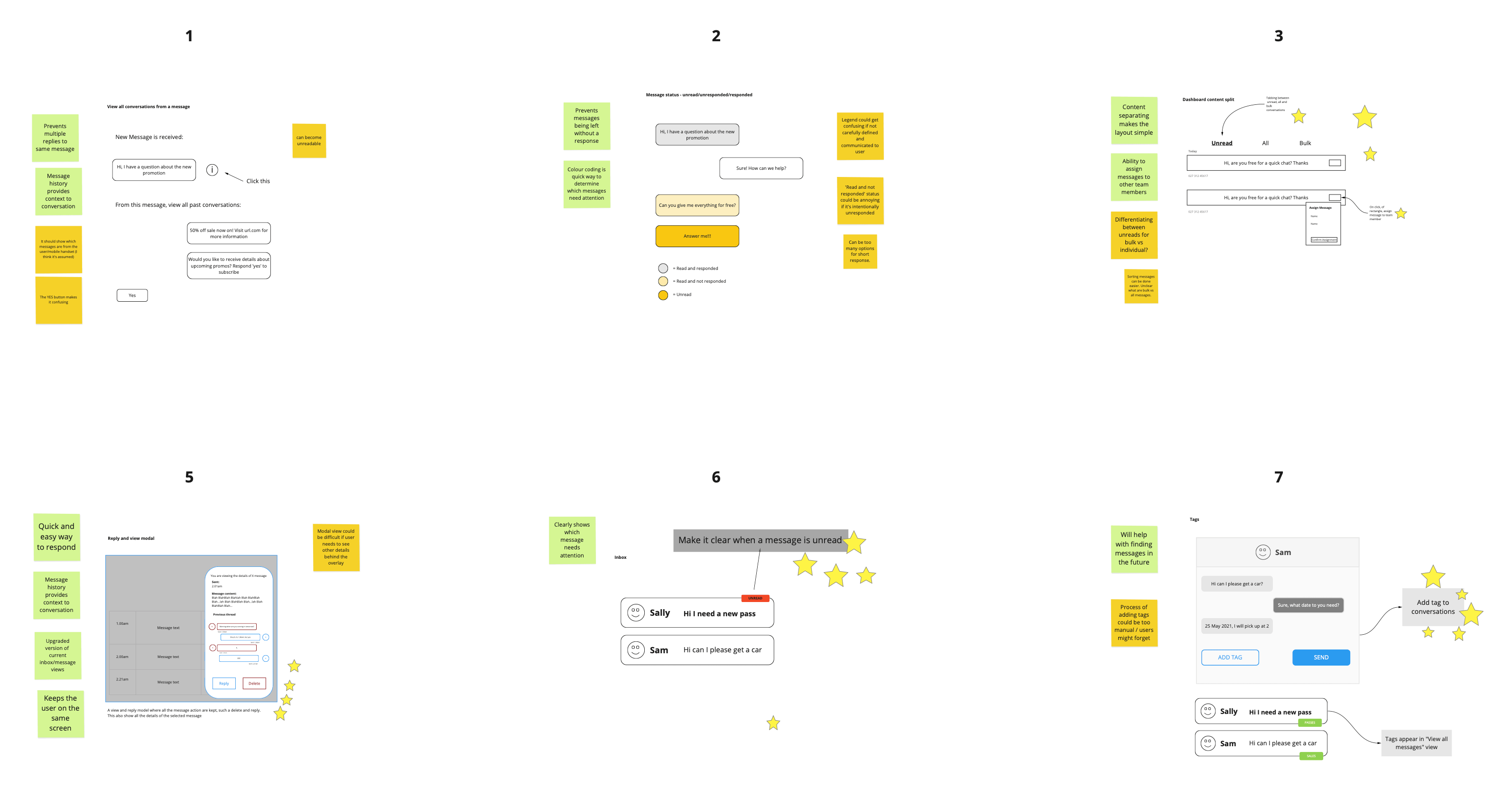
We went through a series of iterations for the new page design - combining the results of the ideation workshops, our findings from competitor research, and our own understandings and ideas of how to best solve the challenges.
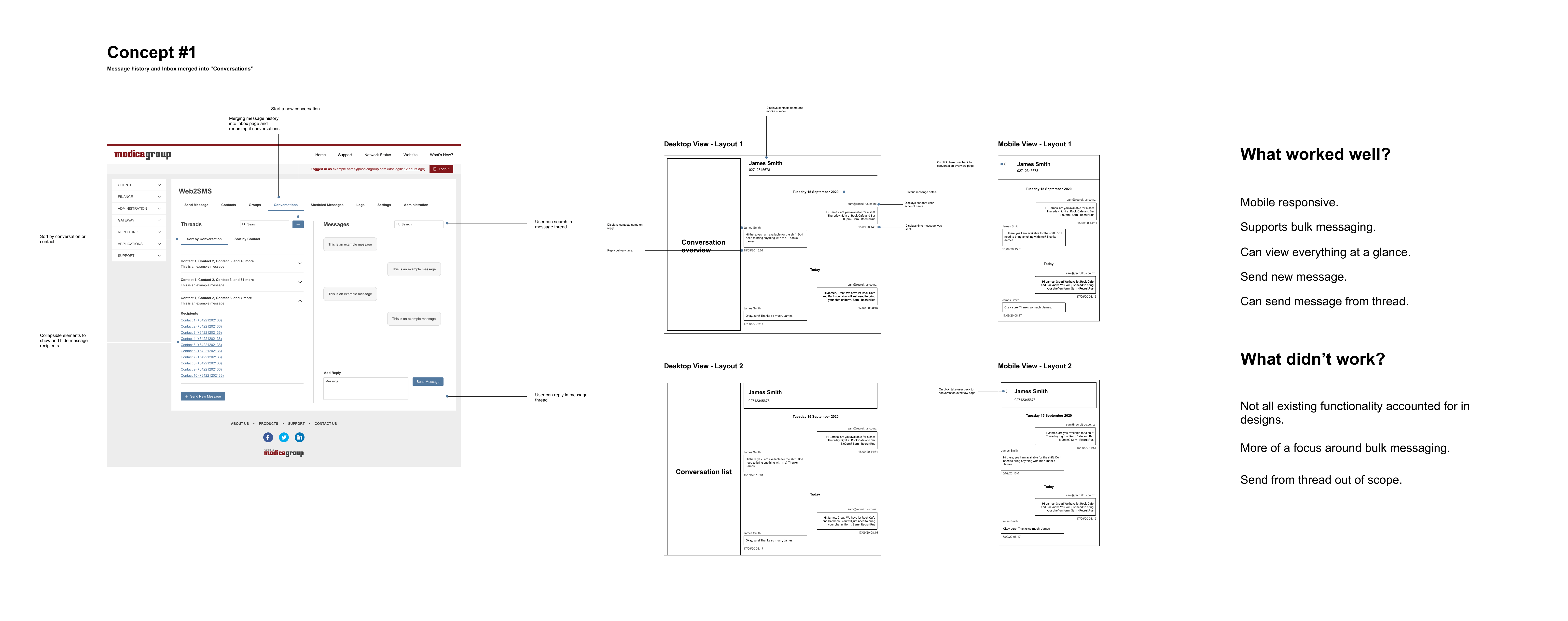
Very early on we realised we wanted to create a 'split' view with a conversation thread list on the left and the selected conversation view on the right. As we progressed through the wireframes stage we explored different ways of arranging the functions on the page and how the user would interact with these.
As we continued with our iterations we realised the scope of the project was growing significantly, and made the decision to limit our first round of changes to an MVP release. We dialled back on our changes and focused on solely updating the Inbox area, and moved some other features to post-MVP.
User Testing
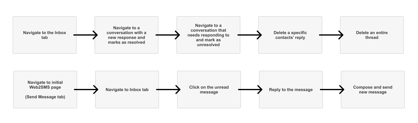
Because we were changing the page heavily, we wanted to test the assumptions we made to ensure users will understand how to perform the primary actions of the page.
- Users can find the relevant conversation and know how to select it.
- Users will know which conversations have new messages, and which messages in the chain are new.
- Users will know how to reply to a conversation thread.
- Users will notice the controls for marking messages as (un)read and understand how these function.
- ... and so on.
To validate these, we set up prototype testing sessions with users of the existing Web2SMS inbox, as well as some testers who weren’t already familiar with the platform.
Each testing session has a nominated facilitator who ran the participant through the exercise while two observers recorded reactions and behaviours as they first experienced the new interface. We started the session by framing the context of the test, giving the user the role they were filling for the actions we wanted them to perform.
The user tests overall helped us confirm we were on the right path for the design of the new inbox, and revealed some opportunities to refine the functionalities of the page.
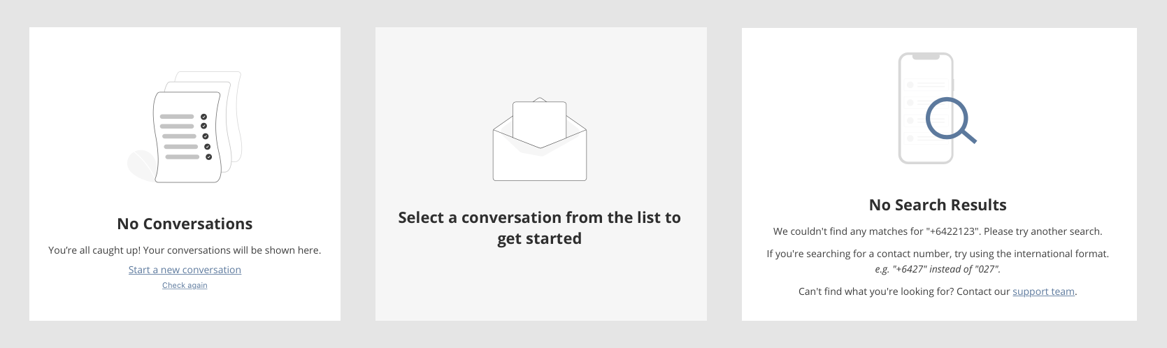
Based on the results we updated some behaviours around marking messages as (un)read and archiving conversations, and made some layout and label changes to make the inbox more intuitive. At this point we also introduced the empty states to improve clarity when sections were empty or had no selection.
A/B Testing
Once MVP development was complete, we set out to release the new version through feature-flagging tool LaunchDarkly. This allowed us to deploy based on particular segments of users, environments, and other factors. We could also add a percentage-based roll-out in addition to filtering by user.
We used feature flagging to run a performance experiment, tracking custom KPIs to measure how well the new version is received in comparison to the old.
We evaluated reception of the inbox through the amount of messages being sent between both versions. We went with a 50/50 A/B split shown to a limited selection of users, and let the results gather for a couple of weeks. Before this we also ran an A/A test where both groups are being shown the old inbox, in order to discover the natural variance of data between the two segments.
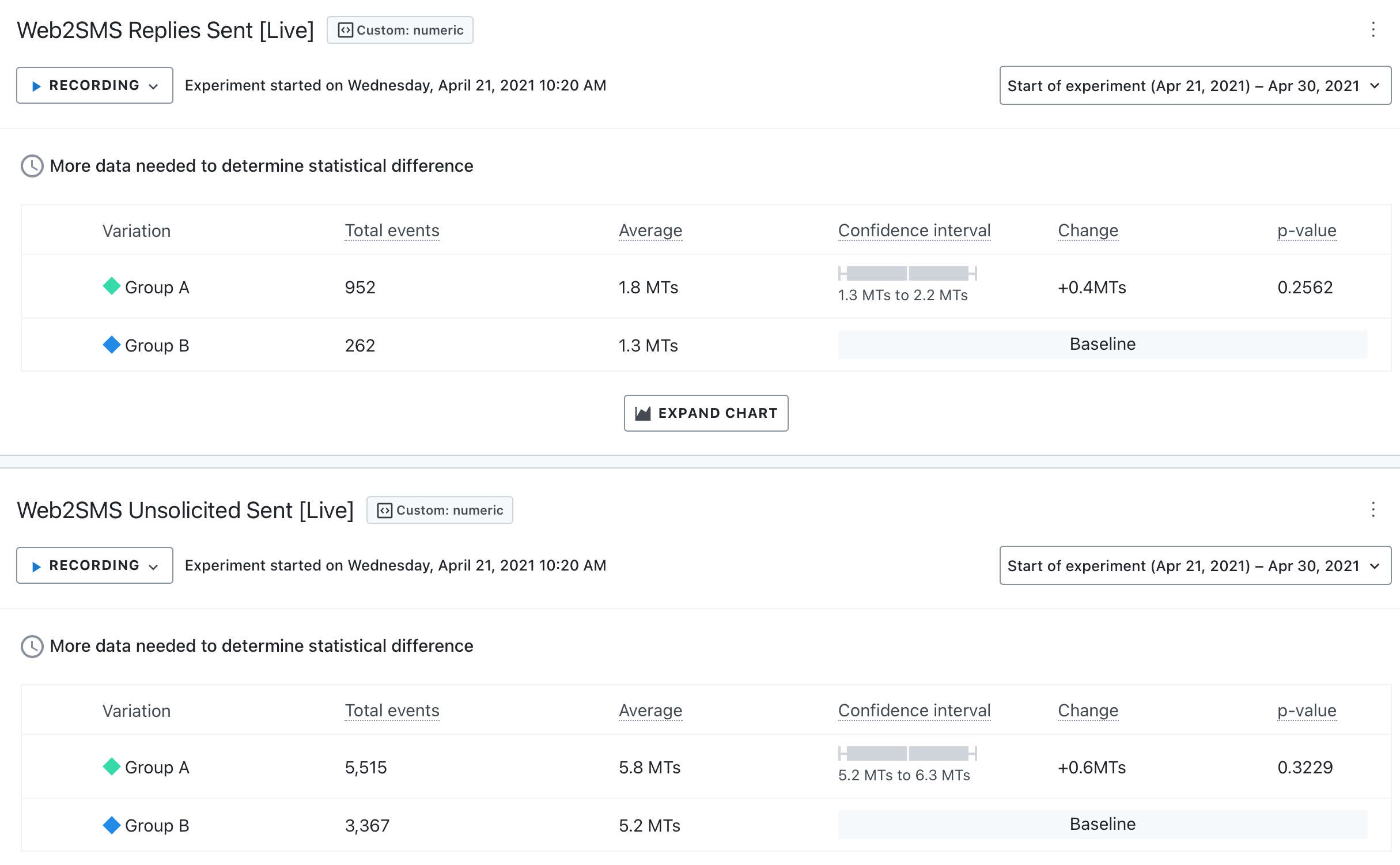
In the above screenshot, Group A is the one being served the new inbox. The 'total events' column is how many times a group of messages is sent (so a message sent to multiple recipients at once is still one event). And the 'average' column is how many recipients are in one message event on average.
All-in-all, we observed a noticeable improvement in messaging with the new inbox, even in comparison to the previous A/A test. This analysis combined with the positive user feedback we had received from the roll-out meant we knew we were making a difference in the Web2SMS experience.
Naturally, this wasn’t the end of our UX design process. We continued to evaluate and refine after the initial delivery, taking on feedback and observing release metrics to inform our post-MVP roadmap.
Get in Touch
Interested in working with me?
I'm not taking new projects right now, but I always love getting to know great people.